Creates customizable plots of expression data-derived data.
Author: Rachel Melamed, Gordon Hyatt, Benoist-Mathis Lab, Joslin Diabetes Center
Contact: gp-help@broadinstitute.org
Algorithm Version:
Summary
Multiplot allows users to create 2-parameter scatter plots from microarray data. The scatter plots created are customizable and interactive. On such plots, each probe (gene) is represented by an individual dot, whose identity and characteristics can be queried. The two axes represent two values chosen by the user, allowing any combination of parameters to be displayed. There are also default parameter subsets for commonly used plots: Fold Change vs Expression (“MvA”), Fold Change vs Significance (“Volcano”), Fold Change vs Fold Change (“FC/FC”).
Conceptually, the representation and user interaction that underlie analyses with Multiplot derive from the software tools used to analyze cell populations in multiparameter flow cytometry. This is particularly true for the flow cytometry “gating” concept: select a group of genes that have particular characteristics for one or more parameters, and display their values for another set of parameters by filtering or with color highlights.
Multiplot is thus most useful for chip data with several classes (experimental conditions). For such data, a user might want to know not only what genes best distinguish between two classes, but also how the gene sets that distinguish two classes behave in the other classes. The tool allows the user to easily create plots comparing expression in different classes, and to add highlights of gene sets of interest from other comparisons. Multiplot is also quite useful for quality control, particularly when where there are limited numbers of replicates for each condition, and where statistical tools better suited for larger datasets cannot be applied. Highlight plots can be used to test whether the aggregate behavior of a gene set applies in all replicate pairs. In addition, scatter plots are quite useful in bringing forth the artifactual changes created by gross outlier values, which can then be filtered out.
The plots are based on values pre-computed for Multiplot by the MultiplotPreprocess module. These include quantifications of all genes’ values within each class (mean expression value, coefficient of variation), but also pairwise comparisons between all classes in the dataset (ie ratio of expression, p-value).
The user can control the style and scale of the plot and can select data points (chip probes). A “dashboard” indicates what values and classes are shown and how they are filtered or highlighted.
The Multiplot module uses data created by the MultiplotPreprocess module as input. It allows the user to make two-dimensional scatter plots of many expression metrics (class mean, fold change, coefficient of variation, Student’s p-value, and Hochberg-adjusted p-value). Features include:
- Plot any combination of the values.
- Auto or manual scales, log or linear.
- Highlight and/or filter out data points based on the probe’s value in any of the data columns, or based on a list of probe names
- Interactive graph: points can be selected individually (by click) or in groups (in a rectangular marquee) to identify
- Generate and manipulate gene lists from the graph.
- Save plot settings.
- The input file created by MultiplotPreprocess file should not be edited
Overview of Multiplot Functionality
The following screen capture and caption boxes demonstrate how a user could utilize Multiplot. Here, the comparison of “B6 WT” versus “B6 KO” is plotted, but highlights add more information.
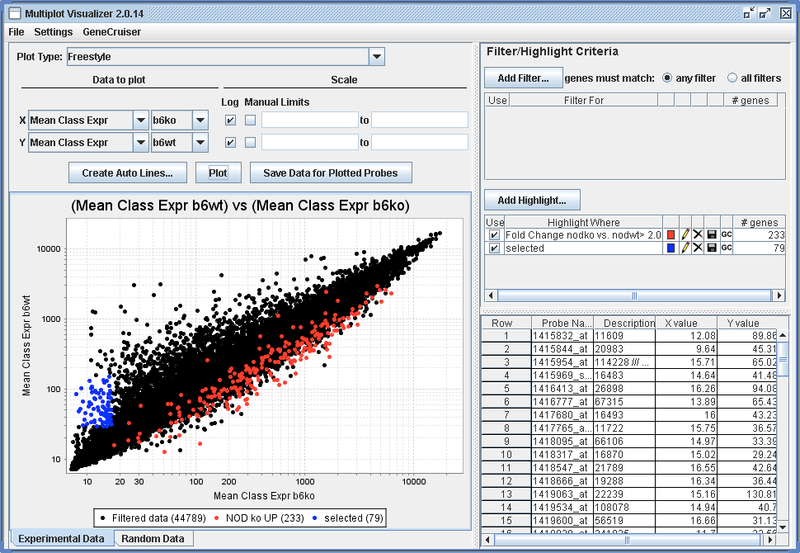
Red dots are an example highlight based on expression ratio in other classes.
Blue dots are an example highlight based on the user dragging a rectangular area on the plot with the mouse.
Multiplot Tutorial
Starting the program
MultiplotPreprocess
In order to run Multiplot, you must first run the MultiplotPreprocess module, found in Analysis -> Preprocess & Utilities -> MultiplotPreprocess. Drag in the data file (.GCT) and .CLS file that you want to plot. Then choose the options for data generation:
- Replicate FC: if this is set to “no” (default), then fold changes will only be computed between the aggregate class expression levels. If this is set to “yes”, then fold change will be computed between every replicate and every other replicate. This will take more time and will result in a much bigger input file. Only available for multiple replicates.
- Random Data: “no” is the default setting. If this is set to “yes”, then random data will be generated based on the mean and standard deviation of the given data. Fold change and other data is also created for this random data. This option also increases computation time and file size. Only available for multiple replicates.
- Outlier Elimination: If this option is changed to “yes”, then expression values that are considered to be outliers (when compared the to expression values for the same gene in the other replicates) will be removed from all calculations. The aggregate class expression value for the class for a gene with an outlier expression value will be be based on the average of all the replicate values but that outlier value. This option is not a good choice if you have few replicates.
- Do Stats: The option defaults to “yes.” This will create t-test, and Hochberg adjusted t-test values.
Press “Run.” This can take a few minutes. A folder should pop up in the “Results” window. If you open it, you will see a zip file. This will be used to give Multiplot the data to plot.
Start Multiplot
In GenePattern, select the “Visualization” menu, and then select “Multiplot.” This will bring up a screen similar to the one below. In the “Results” window, open the folder called “MultiplotPreprocess.” It contains the results of the run of MultiplotPreprocess, which includes a few files, including a “____.zip” file. Drag the zip file to the “input file name” box. Multiplot also allows you to set:
- Number of plots: the display can either show two plots side by side, or one plot. Many systems will not have a high enough resolution capability for the two plot option to be useful.
Press “Run.” It can take a couple minutes to start. There’s no need to press “Run” more than once.
Choose what to plot
Plot type
First choose from the Plot Type options. This will help narrow down the choices of what data types to plot on the X and Y axes. Click on the dropdown and you will see the following choices:
- Freestyle: choose between any data types
- Fold Change vs Fold Change: only fold changes
- Expression value vs Expression Value: only expression values.
- Fold Change vs Mean Expression Value (MvA): classic MvA plots
- Pvalue vs Fold Change (Volcano): choose between T-test results and Hochberg adjusted T-test values, plotted against fold change.
The choices depend on what you select for MultiplotPreprocess. If you selected to create replicate vs replicate fold changes, then “Replicate vs Replicate Fold Change” will be an option (Note: Replicate fold change can only be plotted within this plot subset. These factors do not show up in the Freestyle setting because there are usually very many of them).
Axis selection
Once you have chosen a plot type, choose which data to plot on the X and Y axes. Data types include:
- Sample expression: the expression value for an individual chip.
- Mean class expression: the aggregate expression values for chips labeled as belonging to the same experimental condition
- Fold change: the ratio of the expression values of two mean class expressions.
- Coefficient of variation: measure of variation of expression values within a certain class. (standard deviation divided by mean)
- 2-Class mean: mean of the mean class expressions of two classes. Used primarily in the “Fold Change vs 2-Class Mean” plots (aka MvA plots).
- Sample fold change: fold change between two sample values (as opposed to fold change between two mean class values).
- T-test p-value: p-value of difference between samples in two experimental classes, derived from the t-test.
- FDR (Hochberg): p-value adjusted for multiple hypothesis testing (conservative).
- FDR (Random data): rate of occurrence of the observed fold change in a set of random data., fold changes, mean expression values between classes, t-test results, etc.
To select the X and Y factors, first select the data type, If, for example, you choose to run Pvalue vs Fold Change (Volcano) plots, for X you can choose only the Fold Change data type, and for Y you can choose between two types of measures of statistical difference—either the T-test value or the Hochberg T-test value, with adjustment for multiple testing. Once you’ve chosen a data type, choose which classes you want that data type for. For example, if you want to plot the ratio of class A to class B, select “Fold Change” from the first dropdown, then select A from the second, and B from the third. Then click the “Plot” button. A plot can only be created if both X axis and Y axis are selected.
You can also customize the axis scale options, or you can leave these to the default. They should default to the commonly used settings. For example, it makes sense to plot expression values on a logarithmic scale, so Log is automatically checked once you select to plot expression values.
The Plot Button
You must press Plot for the plot to be redrawn. Any changes to any settings will only show up in the plot after pressing this button.
Create Auto Lines
Auto lines are lines that demarcate a level of differential expression. For example, if you were to compare expression value betwee two classes, drawing lines parallel to the line y=x allows you to see that points beyond these lines have a certain differential expression level.
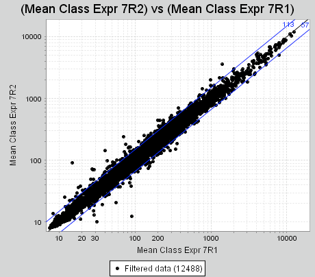
In addition, by default Multiplot counts the number of points that lie outside of these lines of differential expression.
To add these lines to your plot, click on “Create Auto Lines...”, then select the fold change level you wish to draw, and the color. Press “Add” once you’ve made your selections. When you press plot again, the lines will show up.
Note that the lines drawn depend on the Plot Type you have selected. For a Fold Change vs Fold Change plot, for example, the lines will look like this:
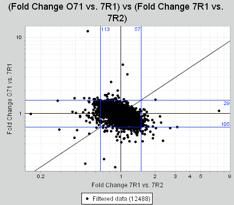
Thus, you must have a Plot Type besides Freestyle selected for these lines to appear on your plot.
Add Filter or Highlight
You can select a subset of genes to either use as a filter, or as a highlight. Filter means that you are filtering out genes that do not meet your set of criteria. Highlight a set of genes to plot their points in a different color, shape, or size, with a legend item title (specified in the “Name” box).
Create a filter or a highlight by pressing the “Add Filter...” or “Add Highlight...” buttons. A box will pop up that allows you to specify the criteria a gene must meet to be included in this filter or highlight. Criteria you can choose include:
- Data type value of a gene: for example, expression value in a condition meet a certain value.
- Gene is a member of a list: You must supply a list of probes of interest.
Data value criteria
Use this criterion selection to choose genes based on their expression values in your data, or in derived data. For example, you can choose to only include genes where the fold change (ratio) of the value in condition A versus condition B is greater than a certain number or less than a certain number.
To create the specifications for the criterion, choose the value you are interested in, and the thresholds, and press “Add”. Note that you can combine multiple data types to make a more complex criterion. For example, you could look for genes with a high fold change in numerous comparisons by successively choosing selection criteria and pressing the “Add” button. You can further control selection by toggling the “Probes can meet any condition” or “Probes must meet all conditions” buttons. In the example below, only genes where the Fold change of 7R2/7R1 is greater than 2 or less than .5 AND the Fold change in ON/7R1 is greater than 2 or less than .5 will be selected. These genes will be highlighted as blue circles.
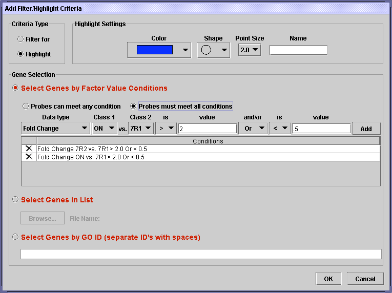
You can delete one of your conditions by pressing the “X” on the left side. When you are finished, press OK. You can always come back to edit the criterion later.
List criteria
If you have a list of probes, perhaps from another experiment, you can select these probes within your data. Go to the “Select Genes in List” option within the “Add Filter/Highlight Criteria...” dialog.
To use this feature, you need to create a plain text file with one probe per line. Then use the “Browse...” button to select that file on your computer. Press OK to finish creating the criterion.
Filter and Highlight display
Once you have added a criterion, either filter or highlight, pressing OK to close the pop up box, it will show up in the main display. An example can be seen in the display snippet below, where the user has selected to highlight all genes where the Coefficient of Variation of class O71 is less than .5.
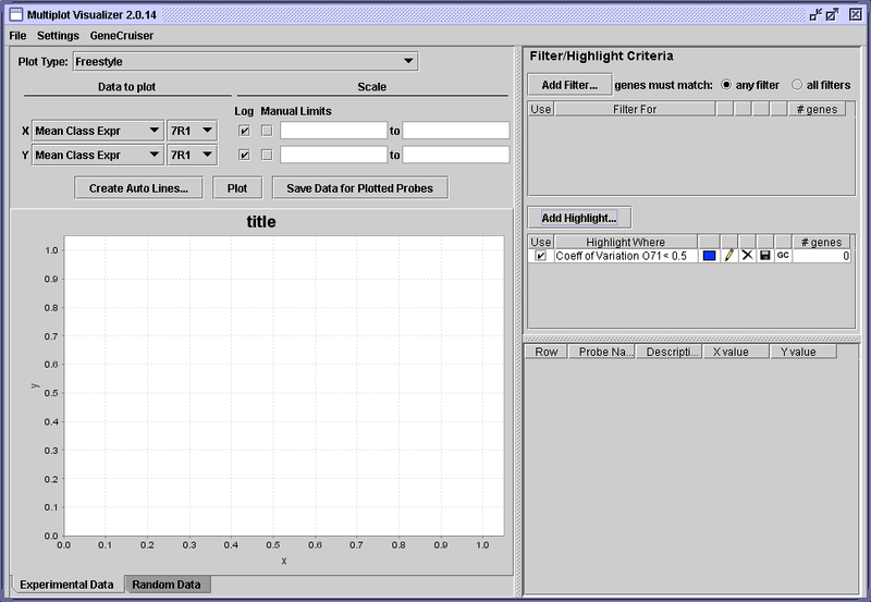
As you add more highlights or filters, more rows will be added to the Highlight or Filter boxes.
For each row (each specific highlight or filter), there are a number of pieces of information and controls for that criterion.
- The leftmost button is a check box that allows you to disable the criterion.
- Next, a summary of the gene selection for that criterion is displayed.
- Beside that, for highlights, is the color in which points meeting the criterion will be plotted. Clicking that color brings up a color selector which allows you to change the color.
- To the right of the color is a pencil icon: clicking this icon brings back the “Add Filter/Highlight” dialog box, allowing you to change the settings.
- The “X” icon allows you to delete the criterion.
- Next to that, the disk icon allows you to save the list of probes currently matching the criterion.
- Finally, on the right the number of genes currently matching the criterion is displayed. Note that this number can change depending on your selections—if the criterion is disabled, the number will be 0. If a filter is added that removes some of the genes that had matched, the number could be reduced.
One last feature of the Filter and Highlight display is the toggle button at the top of the filter display that allows you to choose how multiple filters will be used. If you choose to unite them so that “genes must match: any filter”, then the results can be quite different from choosing that “genes must match: all filters.”
Save Data for Plotted Probes
Using filters, you can create a subset of genes that you find most interesting. One potential use of this subset is to save this data and use it in other programs. Click on the “Save Data for Plotted Probes” button to do this. This will bring up the dialog below:
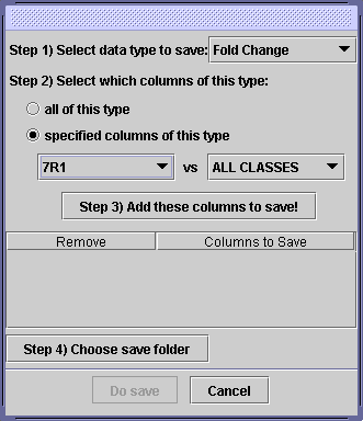
Use this dialog to choose what data “columns” you want to save. For example, you could choose to save Fold Changes of condition X versus every experimental condition, and you could choose to save that in your “My Documents” folder. To do this, perform these steps:
Step 1) Select data type to save:
Click on the dropdown, and select “Fold Change” as the data type you want to save.
Step 2) Select which columns of this type:
You can choose to save all columns, ie every Fold Change that has been created from your data. If you wish to specify columns, change the toggle to “specified columns of this type.” Then you can choose specific fold changes to save. You can either pick one fold change or pick “ALL CLASSES” for one of the selections. In the example above, you will save 7R1 versus every other condition.
Step 3) “Add these columns to save!”
Press this button to add the selection. You can do this numerous times to create your desired output data. If you want to remove one of your selections, press the “X” button next to it.
Step 4) Choose save folder
Pressing this will bring up a dialog where you can choose your save folder. The files will be automatically named and stored in that folder.
Finally, press the Do Save button to create the files.
Plot interactions
The plot created is interactive. Use your mouse to access the following features:
- Click on points: this selects the point. The point shows up in the table, where the probe name and values can be viewed.
- Drag a rectangle: this will select points in the rectangle, as above. Note that the rectangle must be dragged in the DOWN and RIGHT direction.
-
Drag a rectangle with the right mouse button (again in the DOWN and RIGHT direction): this will pop up a dialog with a few choices.
- Create a criterion: this will save the probes in the rectangle in the file chosen, and create a criterion based on that list.
- Add to a list-based criterion: if you have a probe list-based criterion, probes selected which are not already in that list will be added to the list, and added to the probe list file.
- Zoom: zoom in on that section of the plot.
- Drag a rectangle in the UP or LEFT direction: this will zoom out to the automatic zoom settings.
Information table
When data points are selected from the graph, the points will show up in the information table. This table shows the Probe Name and Description values from your GCT file. It also shows the X and Y values of the probe at the time that it is added to the table.
Menu bar
There are a few options at the Menu Bar on top of the window.
- File -> Save Plot Options. this will bring up a box allowing you to specify a file to save the plot options to. This should save the axis selection, the highlights and filters, and the auto lines that have been chosen.
- Settings -> Point Size/Point Color/Point Shape. This will set the appearance of the non- highlighted points. They default to midsized black circles.
- Settings -> Plot Random Data. This will choose whether or not the random data will be plotted when you plot the real data. If random data is plotted, it can be viewed by selecting the “Random Data” tab beneath the plot. Note that not only are the X and Y coordinates taken from the randomly generated data, but also the criteria selection is based on the random data (ie: genes where the expression value is greater than some value in the random data, not in the real data, will be highlighted).
Parameters
| Name | Description |
|---|---|
| input file name * | File created by MultiplotPreprocess (.zip) |
| number of plots * | Smaller one-plot visualizer or larger two-plot |
* - required
Platform Dependencies
Task Type:
Visualizer
CPU Type:
any
Operating System:
any
Language:
Java
Version Comments
| Version | Release Date | Description |
|---|---|---|
| 2 | 2013-10-21 | Updated for Java 7 |
